
A Deep Dive into LGBTQIAP+ Inclusion in the Design Process

Listen to this blog post.
A Deep Dive into LGBTQIAP+ Inclusion in the Design Process
Hey everyone, we’re back again with our deep dive series! This week we will be exploring what inclusive design is, some key concepts of inclusive design, and how to incorporate LGBTQIAP+ inclusion in the design process.
What is Inclusive Design?
As the name suggests, inclusive design is about including everyone. Inclusive design reflects the core human factors concept of individual differences: that consumers have a broad range of perspectives, languages, ages, backgrounds, cultures, abilities, genders, sexualities, economic statuses, and other characteristics. By taking into account these differences, we can design products, experiences, and environments that will serve as many people as possible.
Another way to look at inclusive design is to approach it as eliminating exclusive design. While it is common to hear that we should be “designing for the 80%,” this is typically based on societal and economic measurements rather than how people will actually use a product or experience an environment in their day-to-day lives. Even the other end, “design for the extremes,” assumes that there is a particular “normal” user (which the “extremes” are far away from). Decisions made in the design process determine both who can positively interact with a product or environment and who is excluded from the experience.
Inclusive design allows us to provide the same high-quality experience for all users. Susan Goltsman, a thought leader and advocate for inclusive design, emphasized that inclusive design is not about creating one product for everyone. Instead, we are creating multiple ways to participate so that everyone can experience our product, service, or environment.
Although inclusive design might initially be intended as a way to ensure marginalized groups are not left out, the design decisions that result from this process usually benefit multiple user groups. For example, the ability to switch to a “dark mode” interface can be beneficial for users with vision problems (e.g. cataracts) and is also a type of interface style that many other users prefer for aesthetic reasons. Transcripts and subtitles for audiovisual content may be offered to serve people with hearing challenges, but they are also useful to people who do not have headphones in a public place like a library or on public transit.
Additional side effects of inclusive design include:
- Enhancing the user experience for all users
- Creating a sense of belonging for everyone
- Improving team motivation, engagement, and innovation
- Positioning our brand as a market leader
- Increasing sales by expanding our consumer base
Changing methodology, especially at a company with established processes, can be challenging. In this case, it may be helpful to tie inclusive design into the company’s strategic objectives.
We can get more buy-in with inclusive design by tying it to the company culture and goals. For example, if one of the core values of the company is providing high-quality customer service, inclusive design will help tangibly bring that idea into the design of our products, services, and environments. For our more financially-minded colleagues or stakeholders, we can emphasize the cost savings and revenue increase we can expect by implementing inclusive design.
A 2018 study found that 63% of global consumers prefer to make their purchases from companies that reflect their own values and beliefs and avoid those that do not. The Centre for Inclusive Design in Australia reported in 2019 that incorporating inclusive design methodology could allow products and services to reach up to four times as many consumers and increase revenue in the retail sector by up to $4 billion.
If hiring more people with different perspectives, abilities, and backgrounds is currently out of reach, we can always look to fostering partnerships with communities to ensure their point of view is still heard in the design process. In this way, design teams can create products, services, and environments that work well for everyone and not just the groups the members represent.
Inclusion? Diversity? How Are They Different?
Inclusion and diversity are often talked about together, or even as interchangeable concepts. However, while related, inclusion and diversity are two different things. In short, diversity is the “what” or “who” and inclusion is the “how.” In the workplace, we can think of diversity as the people who make up our team or company and inclusion as the company culture that enables our diverse team to thrive.
When it comes to the design process, we can think of diversity as our different team members and end users, and inclusion as how we incorporate these different perspectives, backgrounds, abilities, and needs into our user research studies and end product, service, or environment designs. As an example, we may recruit participants for a user research study from a variety of different communities (diversity) and make sure that questions are both worded appropriately and have options that allow for all identities when applicable (inclusion).
Still wondering how diversity is different from inclusion, especially when it comes to the LGBTQIAP+ community? Our deep dive into this very topic is coming out soon!
What About Accessibility and Universal Design?
Accessibility has become an essential part of good design. We typically think of physical abilities when considering accessibility: eyesight, hearing, motor/mobility, and seizures. Sometimes cognitive ability, such as memory and concentration, is also a factor in the design process.
A helpful way to think about the difference between inclusion and accessibility is that inclusive design is the process and accessibility is one of the outcomes. As we make a design more inclusive, we are making it so that people of all different abilities can use it. By accommodating people of various abilities, we are creating something that is accessible. Accessibility in design is usually defined by national or international standards and is considered the bare minimum.
Universal design is about creating one product or experience that can be accessed at the highest quality for all users. In contrast, inclusive design is about including multiple ways to access the experience or product to achieve the desired end goal. These concepts can also be distinguished in their applications: universal design is most often thought of in regard to environments and other physical objects (when it is more challenging and costly to have multiple variations) while inclusive design is most often thought of when designing digital products (when it is easier and less expensive to include variations within products).
Interested in learning more about accessibility and universal design? Don’t worry! We will have future deep dives on the intersection of Human Factors, accessibility, and universal design in the future, so stay tuned!
Key Concepts of Inclusive Design

Image source: UX Indonesia | Unsplash
Now that we have an idea of what inclusive design is, we can pull out some of the key concepts of this methodology. When we want to make sure our designs are inclusive, we need to:
- Get to know the people we are designing for
- Identify and address exclusion
- “Solve for one, extend to many”
- Provide a comparable experience to all
- Integrate inclusion into every step of the design process
1. Getting to Know U(sers)
The idea that we need to get to know the people we are designing for - and that we are designing for all possible users - is not a new one. In 1997, the National Research Council released a report, More Than Screen Deep: Toward Every-Citizen Interfaces to the Nation's Information Infrastructure, which was a collaborative effort between experts from multiple disciplines. Computer engineers, psychologists, sociologists, human factors professionals, designers, and economists worked together to investigate and make recommendations regarding how to create interfaces, particularly for the nation’s information infrastructure, that would be able to be used by as many people as possible. The committee emphasized that “every-citizen interfaces” must give thoughtful consideration to understanding the needs and behavior of potential users.
One way we can do this is by broadening the pool of people in our test groups, collaborators, advisors, and social circles to help collect different perspectives. Our data is only as good as the people collecting it and analyzing it; we need to use diverse perspectives to question the data and make sure it is applied appropriately. When it comes to making the final decisions, we should be including people who are personally invested in the problem we are trying to solve and can empathize with our users.
Even within relatively narrow user pools, there will be a range of backgrounds and perspectives. People may be new users or long-time users, personal or work users, in transit or in one place users, dark-mode or light-mode users, or any of hundreds of other variations. They may bring prior knowledge of similar experiences with them or they may be completely new to this area. It is important to think about these considerations during the design process and allow for the flexible customization users will need given their backgrounds, desires, and needs.
Along these lines, we need to maintain consistency both with user models for what particular indicators mean and within our products, services, or environments. Many users come to a product, service, or environment with expectations for how features will work or can be interacted with based on perceived affordances or signifiers. For example, if text on a web page is blue and underlined, most users will assume it is a hyperlink and can be clicked on to take them to another page. When it comes to consistency within the company, there should be similar language used for all communications, a similar “feel” across platforms, and visual indicators should have the same meaning if they are used multiple times. As an example, we can think of how Apple products all have a similar “feel” to them and are recognizable as part of the Apple brand.
Demonstrating that we have taken the time to get to know our users by seeking out and valuing diverse input and maintaining consistency both with user expectations and within our brand helps to foster a sense of belonging for all users which is crucial for inclusive design.
2. Identifying and Addressing Exclusion
It is natural for us to make assumptions about how the world works and how others will interact with our product, service, or environment design. Still, it is essential that we question those assumptions and recognize that designing based on our biases and assumptions impacts others and can leave people out.
When implementing inclusive design, it can seem a staggering feat to try to come up with how to include all possible users. To make this easier, we can instead consider who cannot use our product, service, or environment and why they cannot do so immediately. By thinking about who is excluded from accessing our design, we can get a better idea of what areas we need to improve. At its core, we are determining the demands placed on the user by our design and how we can modify it to decrease those demands so that more people can access it.
It may be challenging to identify the ways our design excludes different people, particularly if we observe that our development team or study participants are not as diverse as we would want. In such cases, we can reach out to experts and other community members to ensure their perspective is included.
By analyzing who is excluded and why we can further explore how to overcome these barriers. Investigating exclusion can lead us to exciting innovations in products, services, and environments that we might otherwise not have thought to implement. In implementing these solutions, our designs become more meaningful and inclusive.
3.“Solving for One, Extending to Many”
A core principle (and major benefit) of inclusive design is that we are “solving for one, extending to many.” While we may be initially incorporating certain features to account for different abilities and include more people, these features can benefit all users.
Think about successfully implementing accessibility features first, then making your design pretty or otherwise customized. Some examples here include contrast levels and how we guide users to achieve their goals with our product or environment. Color is often used to communicate particular messages to users. We need to be mindful of contrast (usually a ratio of at least 4.5:1) and using other design elements to communicate the same idea to the user. Users cannot read our minds about what they should do with a device or environment; we need to ensure there is clear guidance for what actions are available to them.
One of the core ideas for this concept is that we should be as good at designing for other people as we are for ourselves. Although it may be tempting to disable certain settings so that users can only interact with our end products in the way we might want them to in a perfect world, this is something we should avoid doing. Allowing users to maintain control over settings such as orientation, scrolling, zooming, contrast, and whether or not videos automatically play lets users customize their experience to fit their needs.
Similarly to allowing people to maintain control, a major part of inclusive design is providing users with choices. Psychology teaches us that people think in a variety of different ways; to modify an old saying, there is more than one way to shine a penny. While we might have in mind a particular path users will take to achieve the outcome we want, it is entirely possible that users will prefer to take completely different paths to achieve the same goal. By providing users with options to accommodate these individual differences, we are fostering satisfaction with our product, service, or environment.
4. Providing Everyone With a Comparable Experience
Regardless of how users are accessing an experience, the quality of that experience should be the same for all. Different interfaces should be comparable in value, quality, and efficiency. For example, we can add the ability to customize closed captions (e.g. color-coding, position, font, or size) to provide a higher-value experience for consumers who are hard of hearing or otherwise enjoy using this feature.
A good place to start here is to ask, “What is the purpose of our product, service, or environment?” Without a solid foundation, the rest of the design will be set up for failure. We want to always keep in mind the core purpose of our work, ensure that it can be successfully accessed by the user, and then add on more features and content as needed. As we release these additions, there should always remain ways for the user to focus on the primary purpose of our designs.
Further, as we add more features and content, we need to make sure that these additions provide value for our users. What do users want or need to get more out of our product, service, or environment? People who use a geocaching app may want integration with map or social media apps. People who use a bleeding detection device may not care about such features. Alt text for images is part of good accessibility design for websites, but does our alt text convey everything about the image that we would want it to? We need to remember to consider our user base and how new features and content align with our design’s core functions.
Designing inclusive user interfaces can be more challenging and time-consuming, but it is worth the investment to produce better results and happier users while also expanding our potential user base.
5. Integrating Inclusion
Inclusive design should be incorporated at every step of the design process, from the initial strategy session to the final product’s release. Team members must be sure to have good communication about inclusive design elements, as well, or they may be misinterpreted or forgotten completely. By ensuring that inclusive design is implemented throughout the design process, we will achieve a higher-quality end result that is accessible to more users, excludes significantly fewer people, allows for greater innovation, decreases costly redesigns, and increases both marketability and revenue.
LGBTQIAP+ Inclusion in the Design Process

Image source: Zackary Drucker | The Gender Spectrum Collection
Our understanding of inclusion in the design process has evolved over the years to encompass so much more than only physical abilities. Inclusive design recognizes that anyone can be excluded for any reason. Today, we acknowledge that people are excluded from mainstream social, economic, educational, and cultural experiences based on their race, gender identity, sexual orientation, age, physical ability, language, or immigration status. In this deep dive, we are going to take a closer look at inclusive design as it relates to our LGBTQIAP+ community.
As we have discussed, if we do not intentionally include people, we risk unintentionally excluding them. Consider various forms of media: until recently, it was extremely rare to see LGBTQIAP+ representation on television shows, magazines, books, music, and movies (even now, representation still has a long way to go). It is only in the last few years that avatars and demographic questions have begun allowing users to more accurately represent their gender identity.
Of course, there has also been intentional exclusion of the LGBTQIAP+ community. Members may experience denied access, identity demeaning experiences, unwanted exposure of personal information, and other frustrations and personal safety threats. All exclusion, intentional or otherwise, can create a negative consumer experience and make people feel like they do not belong or are wrong for being different. This is just one of the reasons why it is important to make sure that we keep the LGBTQIAP+ community in mind as we incorporate inclusive design methodology.
A recent analysis of the U.S. Census Bureau’s Household Pulse Survey by the Human Rights Campaign Foundation (HRC) found that at least 20 million adults in the United States (nearly 8% of the total adult population in the country) identify as part of the LGBTQIAP+ community. This is almost double prior estimates for the LGBTQIAP+ community’s size. Such a large jump indicates that the community may still be severely undercounted. The data from the survey showed that LGBTQIAP+ people live in every community in every state, with particularly high numbers in California and Texas.
Similarly, Gallup’s 2021 telephone surveys of U.S. households found that the percentage of U.S. adults who self-identify as part of the LGBTQIAP+ community had increased to a new high of 7.1%, more than double their findings in 2012. The more interesting set of information may be found in their generational breakdown of respondents: LGBTQIAP+ identity was much higher for younger generations (about 21% of Generation Z and 11% of Millennials) than for older generations (about 4% of Generation X, 3% of Baby Boomers, and 1% of those born before 1946). The LGBTQIAP+ community represents a growing portion of consumers who may be interested in using our product, service, or environment; it would be a disservice if we did not think about how to include them in our design process.
How to Include LGBTQIAP+ Consumers
From the very beginning, we can make sure we include members of the LGBTQIAP+ community in our design teams and user research groups. If this is a challenge, we can also look to local and national organizations that would be willing to provide input on our designs. To get an idea of what this could be, for marketing and other media we might reach out to third-party organizations, like GLAAD or the National Lesbian and Gay Journalist’s Association, to learn about best practices around media representation of trans and non-binary people. Getting other perspectives will help us to challenge our own biases and assumptions. Understanding these and other stereotypes will help us to avoid them in our own work.
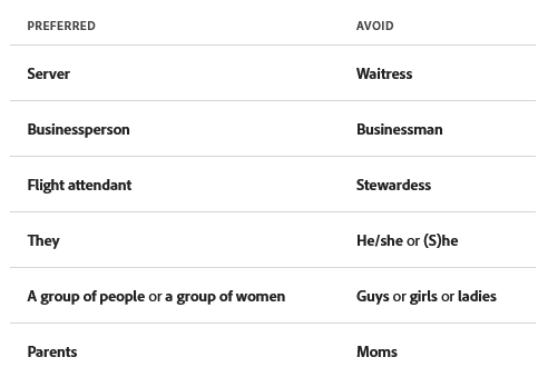
Language should be used thoughtfully: it is a powerful tool in our inclusive design process. By using inclusive language, we encourage potential users to see themselves interacting with our product, service, or environment. In turn, our user base expands and more people feel welcome to access our designs. Inclusive language also helps us to eliminate pain points and avoid accidentally excluding users. To include the LGBTQIAP+ community through the language we use, we need to:
- Avoid words that are inherently gendered (e.g. “guys,” “girls,” “ladies,” “landlord,” “cameraman”)
- Let go of assumptions about pronouns based on gender, sex, or who we think our audience is (e.g. she/her/hers, he/him/his, they/them/theirs)
- Ask for chosen names so that we are using the name our users want to use
- Account for machine learning and AI: these mechanisms can perpetuate biases and stereotypes when they guess genders based on image recognition, text analysis, or other content
Credit: Adobe Spectrum
We can further include LGBTQIAP+ representation through opportunities for interaction, particularly in games, social media, and other digital products. For example, the Summerfall expansion of Elder Scrolls Online (ESO) has a quest line that leads players to a transwoman character. Notably, there are no conversation options to question her identity, make fun of her, or out her without her consent. ESO remains a highly popular massively multiplayer online role-playing game (MMORPG) with over 20,000 users per day. It may seem like a small step, and we still have a long way to go, but it is a promising indicator for the future of trans representation in popular video games.
Similarly, the increased customization of avatars across games and social media platforms has allowed for greater gender expression and acceptance of different gender identities. People will usually have more than one avatar between their social media accounts and various games and can change at least some characteristics of their avatar at any time. This allows for multiple expressions of the self through multiple avatars, either by creating new ones or altering existing ones.
Avatar customization has been found to allow young trans and gender diverse people to explore, develop and rehearse their experienced gender identities before they come out in the offline world. Regardless if people are interested in exploring their gender identity or finding a new way to express themselves, increasing customization options enhances the sense of acceptance and belonging we want to facilitate and better reflects the actual diversity of our users.
We can also consider LGBTQIAP+ inclusion in survey design. A 2017 study of transgender-inclusive measures of sex/gender for population surveys determined that future best practice may be to ask two base questions, one about sex assigned at birth and the other about gender identity, and a conditional third question about what gender the participant expresses most often in day-to-day life if the answers to the first and second questions differed. The authors noted that additional questions regarding more complex gender identity, sex characteristics (e.g. hormone treatments), and sexual orientation may be included as necessary, such as for health research purposes.
A 2009 report by the Williams Institute, Best Practices for Asking Questions about Sexual Orientation on Surveys (SMART), highlights that establishing the collected data will be secure and private is paramount for ensuring LGBTQIAP+ participants feel safe enough to answer questions about their gender identities, sexual orientation, and other personal information. Additionally, the HRC reported that when incorporating LGBTQIAP+ metrics in data collection instruments, researchers should:
- Frame questions in a way that emphasizes self-identification
- Use open-ended questions
- Place questions related to sexual orientation in self-administered portions of the data collection instruments
- Include assurances of privacy, confidentiality, and anonymity where possible in the data collection instrument itself
- Ensure questions regarding sexual orientation or gender identity are not mandatory
- Be mindful of intersectionality (e.g. some racial or ethnic groups may use different terminology; disproportionate representation of LGBTQIAP+ people among those experiencing homelessness)
As human beings, we share common experiences: we have similar motivations and build relationships. These commonalities can give us a good foundation from which to start expanding as we consider LGBTQIAP+ inclusion in our design process. Consider seeking out LGBTQIAP+ perspectives and representation that go beyond the stereotypes - think about beauty, work, education, relationships, or wellness. Members of this community also use hospitals, schools, social media, medical devices, electronics, websites, accessories, utilities, clothing, hobby supplies, toys, sports equipment, instruments, audiovisual media, and tools - people using people things. In our efforts to do inclusive design, we need to be sure to include the LGBTQIAP+ community.
The Human Factors Connection

Image source: Kelly Sikkema | Unsplash
Inclusive design is a complementary design process for anyone who wants to enhance the user experience and work towards making a design accessible to as many users as possible. The key human factors concept of individual differences is reflected in inclusive design as we keep in mind the needs of our different user groups and identify ways potential users may be excluded so that we can design those aspects out of our end product.
Making sure our designs are inclusive can seem like a daunting task. Fortunately, there are some thought exercises and tools that can help.
When working on projects with her public space design team, Goltsman used a thought exercise she called “the I-N-Gs.” The team would be asked to observe how many different activities were happening in a public space similar to the one they were designing. Then Goltsman would ask two questions:
- What I-N-G is most important to this environment?
- How many ways can human beings engage in that activity?
We can apply this same thought exercise to a variety of projects, especially if we rephrase the first question to, “What activity is most important to our design?” This goes back to one of our key principles of inclusive design, providing all users with a comparable experience. Keeping the main purpose of our design at the forefront gives us a great starting point for considering how people may be excluded and how we can change or add features to make sure we include everyone.
Brainstorming with people who have lived experience navigating exclusionary designs is another way to get ideas for how to design inclusively. As inclusive designers, we want to be identifying and fixing mismatched interactions between people and their world. Part of this process involves observing and talking with people who are part of our user groups. User feedback can give us important, useful information about how our designs may be exclusionary and new ideas for what we can do to remedy this.
Another tool for inclusive design is called the Inclusive Design Cube (IDC), first proposed by Keates and Clarkson in 1999. The IDC is intended to relate capability level, population profile, and suitable design approach in a graphical format. Each axis on the cube represents user capability and the different defined volumes reflect population coverage.
Over time, the IDC has been modified to reflect updated understandings of the inclusive design process. It is now associated with a 3-stage, 7-level inclusive design approach:

Credit: Keates & Clarkson, 2001
Similar to the IDC, the Persona Spectrum, was developed by Kat Holmes for Microsoft when they first began using inclusive design. Since then, it has become a tool used by many companies to help with brainstorming how designs can be modified to be accessible to users with varying levels of ability and the permanence of their current ability level.
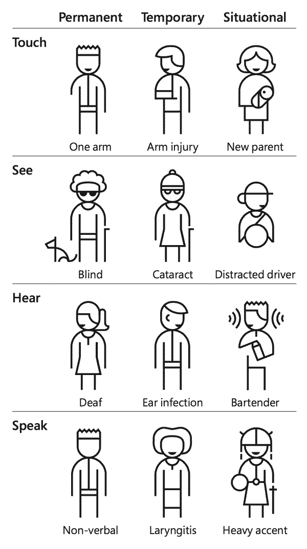
Credit: Microsoft’s Inclusive Toolkit
Permanent constraints are challenges that users experience daily, temporary constraints are experienced for days to months, and situational constraints are only in effect for minutes or hours. Abilities were originally only considered in terms of physical abilities (e.g. touch, sight, auditory, or speech) but have recently been expanded to include cognitive/intellectual ability as well. We can even take it further and consider other demographic information (e.g. race, sexual orientation, gender expression, age, location).

Credit: Sarah Dzida
As we move along in the inclusive design process, we can also take advantage of usability inspection methods. These include:
- Heuristic evaluation: combined inspection reports from independent evaluators; the use of established heuristics (e.g. Nielsen-Molich’s) to evaluate the usability of a design
- Cognitive walkthroughs: single evaluator; considers how well a new user can learn the system by walking through each step of a task flow and answering a set of prescribed questions with the goal to understand challenges new users may face; can be used to quickly evaluate early mockups of a design
- Formal usability inspections: combined individual and group inspections; a formal process for detecting and describing defects; uses clearly defined participant responsibilities and a six-step logistical framework
- Pluralistic walkthroughs: group inspection; assign a series of paper-based tasks that represent the proposed product interface with usability practitioners guiding the users through simulated tasks, facilitate feedback, and address concerns or questions about the interface; can be used early in the design process
- Feature inspection: single evaluator; identifies the tasks that a user would perform with an application and the features that would be used to perform those tasks; features are then evaluated for whether they are understandable, useful, and actually available to the user when needed
- Consistency inspection: group inspection; examining one or more products for internal or external consistency (e.g. when integrating new products or addressing customer complaints regarding inconsistencies)
- Standards inspection: single evaluator; to ensure compliance with industry standards
Many of these usability inspection methods are easy to apply and allow us to evaluate user interfaces when we are between user testing phases (actual user feedback is still essential to the design process). Some even have the advantage of being able to be conducted early in the design process.
Finally, although we have already mentioned some examples of inclusive design throughout this deep dive, we know that different concepts can spark innovation in different people, so we want to include a few more for inspiration:
- Text legibility (e.g. contrast, size)
- Dark mode option
- Surname inputs (e.g. hyphens, special characters, accented characters)
- Demographic identifiers (e.g., race, gender, sexual orientation)
- Nontraditional filters (e.g. by hair type, age range, skin sensitivity, concerns)
- Diverse visual aids (e.g. a variety of skin tones)
Inclusive design allows us to include everyone, expand our user base, decrease costs, and stimulate innovation. There are a variety of tools and thought experiments to help us integrate inclusive design into our projects, many of which we already use. We can use our knowledge of inclusive design and human factors to ensure that the LGBTQIAP+ perspective informs our designs to achieve a greater sense of belonging for even more people.
For more Human Factors Cast content, check back every Tuesday for our news roundups and join us on Twitch every Thursday at 4:30 PM PST our weekly podcast. If you haven't already, join us on Slack and Discord or on any of our social media communities (LinkedIn, Facebook, Twitter, Instagram).
Explore Some More
Related HFC Content
- Designing for LGBTQIAP+ | Human Factors Minute
- Availability of Resources for LGBTQIA+ in Human Factors, UX, and HCI | Human Factors Minute
- LGBTQ+ HFES Affinity Group | Human Factors Minute
- All of Human Factors Cast's Pride 2022 content in one place
What is Inclusive Design?
- Achieving Inclusivity in the Design Process
- Designing for the extremes. How to turn everyone into an a11y…
- What is inclusive design?
- Book: The Inclusive City: Design Solutions for Buildings, Neighborhoods, And Urban Spaces
- Book: Mismatch: How Inclusion Shapes Design (Simplicity: Design, Technology, Business, Life)
- Book: Play for All Guidelines: Planning, Designing and Management of Outdoor Play Settings for All Children
- Video: #13: Microsoft Design Director, Kat Holmes, on the importance of designing for "one-size-fits-one"
- Video: How we can design a world that's accessible to everyone | Darryl Condon
- Video: Kat Holmes: Rethink What Inclusive Design Means
- Video: Mismatch: How Inclusion Shapes Design - Kat Holmes, Director for UX Design at Google
Inclusion vs. Diversity, Accessibility, and Universal Design
- Diversity vs. Inclusion: What's the Difference?
- What is Accessibility: An Introduction | SeeWriteHear
- Why Accessibility is Important | National Center on Deaf-Blindness
- Definition and overview | Centre for Excellence in Universal Design
- Inclusive Design vs. Universal Design: What's the Difference?
Key Concepts of Inclusive Design
- Content that works for everyone
- The Paradox of Specificity: What It Is and How It Works
- Rethinking User Personas
- "User Sensitive Inclusive Design" - in search of a new paradigm
- Using gender-neutral and inclusive language in your writing
- WebAIM: Screen Reader User Survey #7 Results
LGBTQIAP+ Inclusion in the Design Process
- 10 of the best LGBTQ video games to play while self-isolating
- Best Practices for Asking Questions about Sexual Orientation on Surveys (SMART)
- Designing inclusive illustrations (or, a brief history of the meeple)
- Exploring LGBTQ+ Representation In Video Games
- Gender Identity and game avatars
- How Many Adults and Youth Identify as Transgender in the United States?
- Learn Queer Issues to Counteract LGBTQIAP+ Discrimination
- LGBTQ Games: Some Of The Best Queer Storylines And Award Winning Hits
- LGBTQ-Inclusive Data Collection: A Lifesaving Imperative
- Transgender-inclusive measures of sex/gender for population surveys: Mixed-methods evaluation and recommendations
- Podcast Episode: Did you make all your Sims gay too? | A brief queer history of gaming
The Human Factors Connection
- Developing a practical inclusive interface design approach
- Inclusive design and human factors: Designing mobile phones for older users
- The Inclusive Design Cube (IDC)
- Original IDC (Keates & Clarkson, 1999)
- 5-level IDC (Keates et al., 2002)
- 7-level IDC (Keates & Clarkson, 2001)
- The Principles of Inclusive Design
- Study and development of methodologies and advanced solutions to support design of smart and inclusive environment
- To Build More-Inclusive Technology, Change Your Design Process
- Topics in Inclusive Design for the Graduate Human Factors Engineering Curriculum
- Usability 101: Introduction to Usability
- Book: Inclusive Design: Design for the Whole Population
- Course Information: Human factors and inclusive design
- Stock photo libraries:
- Affect — a disability-led stock image and interview series celebrating disabled Black, Indigenous, people of color (BIPOC)
- Createherstock — authentic stock photography featuring melanated women
- The Gender Spectrum Collective — a stock photo library of trans and non-binary models that go beyond the clichés
- Picnoi — a co-op of stock image photography featuring people of color
- Tonl — images of diverse, everyday people
- Video: Usefulness, Utility, Usability: 3 Goals of UX Design (Jakob Nielsen)
Cover Photo by Zackary Drucker from The Gender Spectrum Collection (left) and RF._.studio from Pexels (right)

Digital Media Production Research Assistant
Katie Sabo is currently an undergraduate student working on her Bachelor of Arts in Psychology at CSULB, graduating in May of 2022. She serves as the CSULB HFES Student Chapter Outreach Coordinator with a focus on projects to increase member benefits, such as cross-club collaborations, organization of information into a central hub, documentation of processes, and monthly newsletter. Katie's current Human Factors interests include human factors in health care and accessibility in design.

Human Factors Cast Announces Transition to Nonprofit Foundation
